Wednesday, March 23, 2016

Blog Winner and Gift Tag

Happy Wednesday! I am thrilled to announce the lucky winner from my blog giveaway- Dani Chapman!


Dani Chapman said...
I think this book will be a must for anyone who uses Copics! I love coloring books but this one will be perfect for me so I can get better and more confident using my Copics!
Congrats Dani and I hope that this book will give you some useful tips for any of your future projects with Copics. If you would also like to pick up a copy of this book, you can find Intro to Coloring with Copic Markers here.

Quick Spring Card Project
And, since you are looking around my blog today, I figured I'd share a quick gift tag/card I made from the March Hero Arts Monthly Kit. If you haven't ordered one of these awesome kits yet, don't worry, there are still a few in-stock. Just pop over to Hero Arts to pick it up.  It has been a lot of fun to work with them in adapting my Coloring Flowers with Copic Markers book into stamps and projects!
This little gift tag is made with the cluster of flowers from the Marianne's flowers add on set, stamped with Memento New Sprout colored ink. I colored it using only 6 Sketch markers: G20, Y00, Y21, BG000, R81, and colorless blender. I used the techniques shown in the second project of the Coloring Flowers with Copic book, except instead of having 3 shades of a color, I used only 2, and on the leaves, my lighter green was actually colorless blender, and my darker green was simply allowing the G20 to dry before adding a second layer to get the color just a tiny bit darker. 
I'm thrilled with the final color scheme, and how it matched the card base from the kit perfectly. I chose a clean, simple white ribbon bow and was trying to figure out how to make it just a little bolder. After digging for a bit, I found a perfect little pop of yellow bling in my "drawer-o-stuff" to add to the bow. I held the bow and bling in place with a dab of the X-press it Gel Glue
Have fun coloring!

Saturday, March 19, 2016

Intro to Coloring giveaway

New book for the Coloring Foundation Series!
I was cleaning off my desk and I noticed that I missed a blog post about one of my new books, Intro to Coloring With Copic Markers.

This new Coloring Foundations book is a must have for anyone who wants the scoop on how to use Copic markers! I wrote this book with clear, step-by-step tutorials to guide you through everything from smooth coloring to basic blends. From creating patterns, to properly adding highlights and shadows in a still-life. Images are clean and easy to follow along with, incorporating a good balance of simple to complex techniques.

All the books in the Coloring Foundations series are full color and include text in both English and Spanish. Tutorial images and blank color charts are in the back of each book, ready to be photocopied onto good marker paper.

You can purchase a copy of Intro to Coloring With Copic Markers from the Copic website, or
you can also choose to get an autographed copy of Intro to Coloring with Copic Markers.

Better yet, why don't you leave a comment here on my bog for a chance to win your very own autographed copy?! I'll draw a winner on Wednesday next week. (Limited to residents of US and Canada only, sorry!)

I had a lot of fun writing this book, and I tried to fill it with as many useful things as I could. I hope you find it helpful in your creative process. Good luck winning a copy!

Monday, March 14, 2016

Coloring Ducklings

Add contrast!
You may have noticed that I posted a new blog header recently. Here are a few step-by-step photos of my coloring process for the cute row of ducklings that I used on my header. I made this picture a few weeks ago, while demoing for the University of Oregon Ducks bookstore. (I figured this picture was  appropriate for the U of O.)

Once again, I need to give credit to my dear friend Maaike in the Netherlands for the beautiful reference photo. The whole process, from line-drawing to final coloring took about 6 hrs.

As with most of my illustrations, I started with a pencil sketch based loosely on the original photograph. Then I traced the pencil drawings with a 0.1mm black inking pen. I copied the outline onto my favorite marker paper.

I started coloring the little ducklings, as they were the focal point of the whole image. Y11, Y21,YR000, R81, YG91, Y28, YR14, E44, E47.

If you look close, you can see a corner of the reference photo peeking out. The log that the ducks are on sits in a murky, swamp with lots of interesting colors floating on the water. It took a lot of markers to suggest the water tones. At this point I was pushing at least 30 colors, so I stopped keeping track of all of them.

I like to put a lot of subtle base colors into things like the logs, then I add my dark colors to build up the variations. Compare the back log, which I've already darkened, to the log in the foreground. It is easy to see the yellows, pinks, oranges, and green in the light log. Then, when I add dark tones, it feels less flat. Also notice the pale blue I added on the underside of the log to suggest a watery reflection.

Contrast makes things jump. So, to make sure the ducklings are bright yellow and dynamic, I tried to keep the water behind them nice and dark. I added dark green dark blue, dark purple, dark browns, and all sorts of colors into the water so it looked murky but alive.

The grasses in the background are not as important, so I didn't emphasize those as much and I kept my stronger contrast in the foreground. However, I threw in a little airbrushing to darken it up back there.

My demo time was quickly ending, and I knew it would be a while before I could come back to finishing this piece, so I wanted to get it done before I left. A big risk with any complicated piece of art is overworking it. Knowing when to stop is important! Having a time limit has kept me from overworking many good pieces.

Here is the finished piece, including final touches of white added back in with the Copic Opaque White with a built-in brush. Scanning in artwork and color-correcting makes a world of difference (the lighting at the demo did not bring out the richness of the colors).

I hope you enjoyed the limited tutorial. It's hard to remember to take process photos when I'm also helping customers. May your week be just ducky!


Monday, March 7, 2016

Hero Arts Blog Hop

You know what I like to do? I like to draw and color! I also like to make neat things for my family and friends. So, I partnered up with Hero Arts to work on their March Hero Kits. Then all my online friends can also share the fun of coloring the things I enjoy drawing. These kits are packed with all the supplies you need to make a bunch of beautiful cards to share with the people you love. You add the color, and the kit comes with the rest:

The kit contains: 12 coloring cards on XPressIt paper, coordinating stamps and dies, an Intense Black ink cube (alcohol marker-friendly), extra XPressIt paper, assorted notecards, and a package of gems.

There are 3 optional add-on items -
PS755 Coloring Foundation Book - Flowers: https://heroarts.com/shop-sidebar/ps755-coloring-f…ion-book-flowers/

You can see more at the Hero Arts blog post: https://heroarts.com/my-monthly-hero-is-here-5/

Notice that you can order my Coloring Flowers with Copic book? As an added value I autographed all the books that Hero Arts is selling (I almost got a blister on my drawing finger from signing so many books!). This is a great chance to pick up the coloring flowers how-to book for any of your friends that also love working with Copic Markers.

Flowers are popping up in my yard, and they are popping up on blogs as well.  Join our talented designers for this awesome coloring flowers blog hop and see all the neat projects made with the March Monthly Hero Kit: 

The kit is available for a limited time only - once it's gone, it's gone, so order soon.

Here are some of the fun cards I made using the stamps, dies, stamp pad, flowers coloring cards, notecards & gems. All you need to add are the markers and your own creativity!

Hero Arts card project

Basic color blends
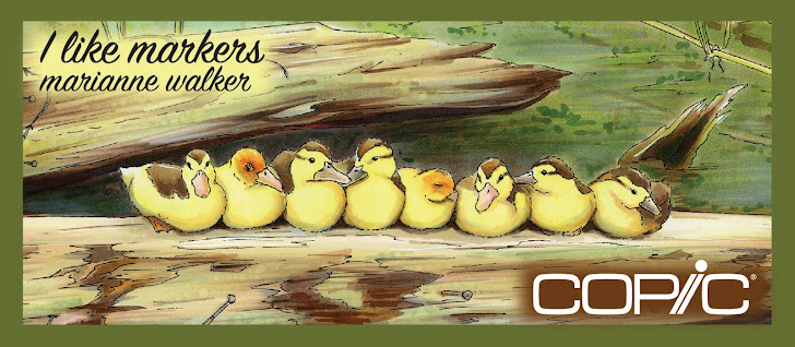
I am so excited to be sharing these fun, exclusive Hero Arts kits! These little pictures, stamp set, and book were so much fun to draw and color. Each of the provided 1/4 page panels are printed on high-quality X-Press It Blending Card, meaning your artwork will pop when colored with Copic Markers!

For this project, I chose the 1/4 pg panel "Beauty is a light in the heart" These flowers are sort of like poppies, but not really. However, I decided I wanted to work with a vibrant, red-orange color scheme, similar to what you might find on poppies.

Whenever I color flowers, I tend to color the greenery first, and this project was no exception. I started with a smooth base of YG11, then gradually went in and darkened each leaf with YG13 and YG17.


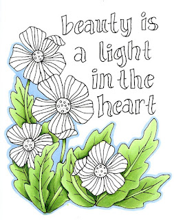
I tried to pay close attention to the veins on the leaves, the shadows between leaves, and the dark areas where the flowers stand out from the leaves. I left the main view of each leaf lighter, as I knew that later on I would be adding more tones over the top.

I finished the leaves with dark accents of G28. Then I added a blue outline to the image with B32. I know I've said this many times on my blog, but contrast is key! Because I have a range of tones from the really light YG11 all the way to the very dark G28, I have a great range of contrast and the leaves are much more dynamic.

The pale blue border pulls everything together. Usually I would add the blue last, but I went outside the lines a little, and the pale blue covers/pushes those mistakes out of the way, so that you don't really notice them as much.

Next I worked on the flowers. I started by coloring the centers with Y02. Then, I colored the petals with YR12. I also added a faint ring around the yellow portion in the center with the YR12 and blended that out, just to give a little dimension.

I colored each flower with YR12, then I darkened it with R05 and added extra contrast with hints of R29. I was careful to darken under each folded petal so those looked more interesting and dimensional.

I think the red really helps the orange pop off the page more, though I worked with a very orange red (R05) so that it was not changing the tone too much. Also keeping the centers a pure, vibrant yellow as much as possible makes the petals look really sharp.


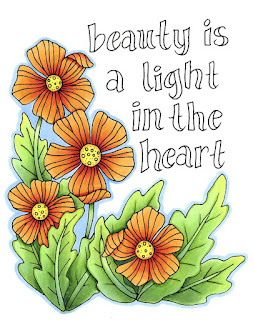
I finished up coloring all the flowers, then I came back with B32 and continued the border around each bloom. I also wanted to add more color depth to the green leaves, so I took the same B32 and added a faint overlay to the shadow areas of the leaves. You can see it in the stems on each leaf. Cool colors, like blue, help make these areas softer and feel more like they are in shadows.

The tips of the leaves I warmed up with a faint layer of Y02. You can barely see it, but it makes those leaves feel more like they are catching the sun. I know it's subtle, but it does help to make the overall piece look more dynamic.

Last, I colored the text with YG11, YG13, and G28. I added a faint blue shadow to each letter on the left side using the B32. This just gives it a hint more dimension.

And, though it doesn't show up on the scanner, I took a peach Spica glitter pen and colored over all the flower petals. Now, in certain light, each flower shimmers. I love how easy this project was and how beautiful it came out. My goal in drawing these cards for you ,was to help you have beautiful results easily, so let me know how it goes with your own project.

I hope each of you has as much fun coloring these as I have had! Now, I encourage you to go visit the rest of our fabulous team members to check out the other awesome creations for this monthly Hero Kit by Hero Arts Blog hop.


Friday, March 4, 2016

Hero Arts Sneak Peek

March is here and I'm so excited! Why am I so excited? Because I have been working with Hero Arts to design a fabulous March My Monthly Hero Kit.This kit was based on my Coloring Flowers with Copic Markers book, and now you can have a pile of flowers to color in, using the techniques you learn from the book! 

Jump over to The Hero Arts Blog and leave a comment for a chance to win a couple of prize packs!  We will have two prizes during the hop: a kit ($29.99 value), and also a prize package from Marianne consisting of a 3 pack of Sketch markers, a Flowers Line art pack, and 3 Kirarina 2win scented markers. Over $40 retail value!

Prizes will be announced on Monday, when the full kits are announced. Order your kits on Monday, March 7th.  Be sure to check back then, as you can also follow along with our inspiring designer blog hop. 
Then, once you see the great things you can make from these fun stamps and kits, order your kit quickly! Because the kit is available for a limited time only - once it's gone, it's gone.